Analyzing Yield Curves with PCA
A bond’s yield is the amount that it pays each year in interest as a percentage of its current price. For example, if a bond is sold at $100 and pays $5 per year, its yield is 5%. When the price of a bond goes up, its yield goes down – if that same bond is now being sold for $105, its yield would be 4.76% (5/105). And the same applies the other way around – if the price of that bond dropped to $95, its yield would go up to 5.26% (5/95). A bond’s yield (as per its current price) is, effectively, its current interest rate. - finimize.
In this notebook I used PCA to analyze the yield curve of government bonds with different maturity: 1/2/3/6 month and 1-10 years. The data contains the monthly yield in the for the years 1992 through 2015, and thus covering the extend of the financial crysis that unfolded in 2007 and 2008.
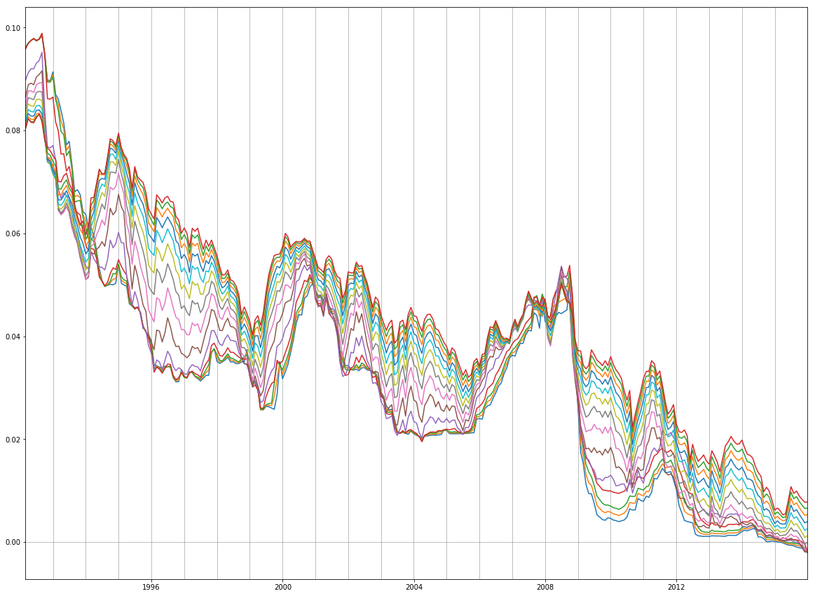
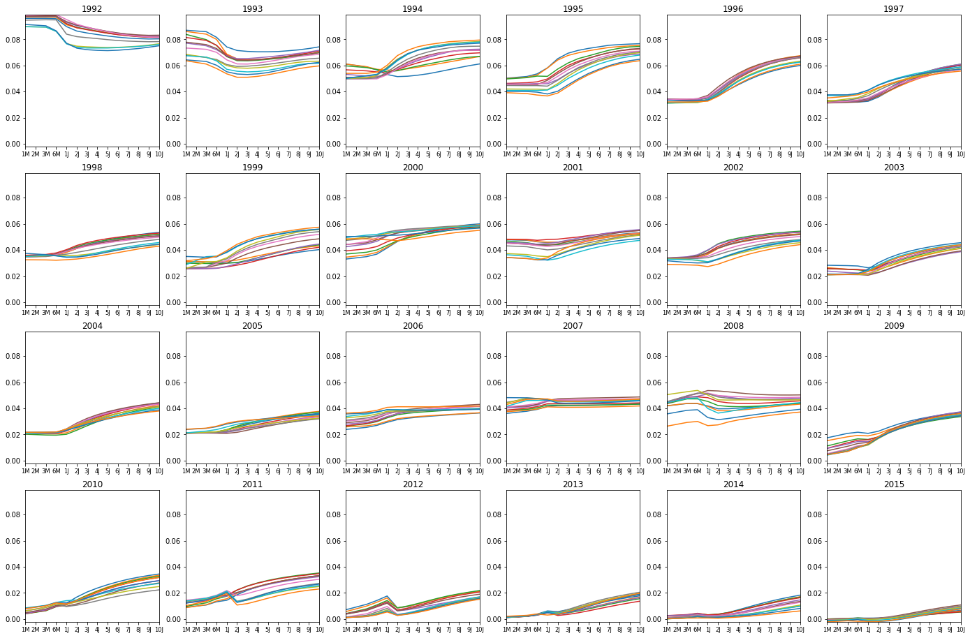
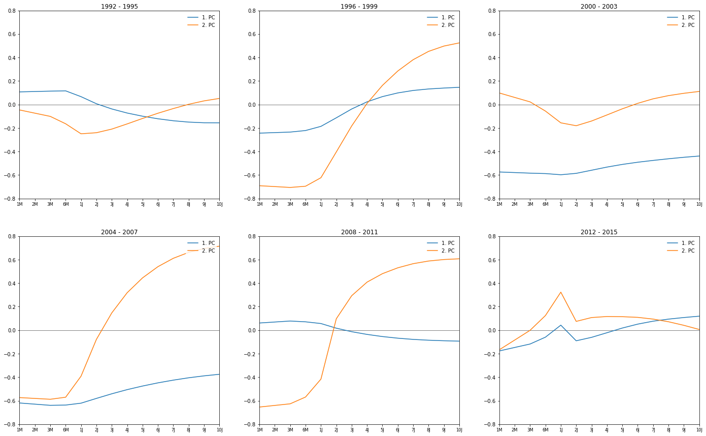
The effect of the crysis is clearly visible in the yield curves as the yields of all type of bonds drops towards the end of 2008 (first plot). In the second plot we can see that the yield of bonds with shorter majurity depreciated more in 2008. That is because as the uncertainty in other investments increased during the year, investors flocked to relatively save government bonds for short-term investments, and hence the prices of the bonds went up and the yields down (see quote at the top).
For the principal component analysis (PCA) I use the yields of the bonds of different maturity. Hence, each month is a datapoint with 14 features. The goal is to reduce the dimension to two while retaining as much information as possible and the plot the datapoints over those two new dimensions.
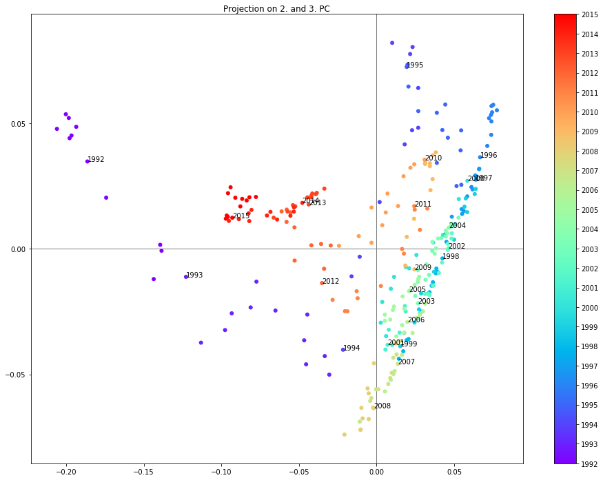
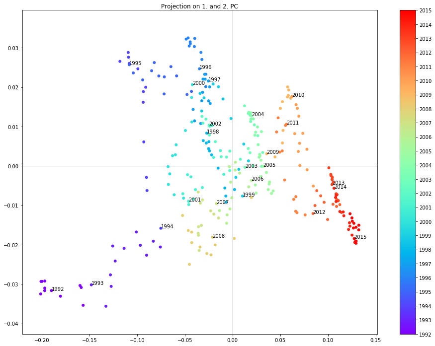
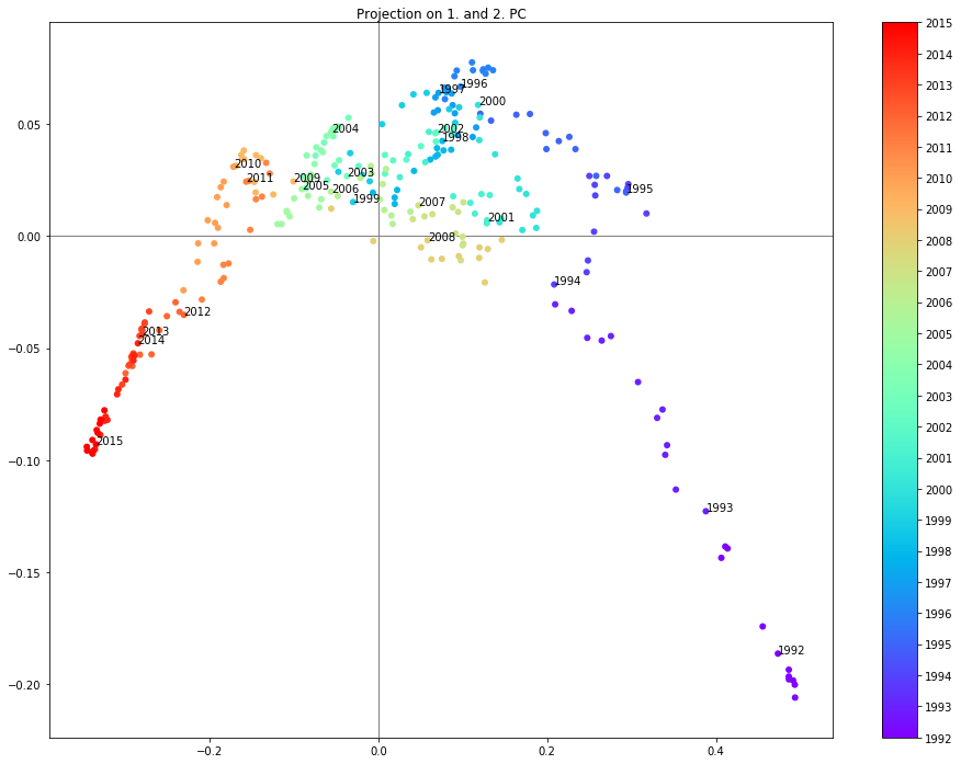
For example when projecting the data onto the first two principal components (see below) it is possible to clearly see the years grouped in different regions. One interesting observation is that the years 2007 and 2008 are in a different region than the years 2009-2011 following the crysis.
PCA
Find the SLC (e.g. a projection) with maximum variance:
\[\max_{a:||a||=1}Var(a^TX) = \max_{a:||a||=1}a^TVar(X)a\]Setting \(a=\gamma\), with \(\gamma\) the Eigenvector of the largest Eigenvalue \(\lambda\) of \(Var(X)\) will satisfy this OP.
\[Var(X) \gamma=\lambda \gamma\] \[(Var(X)-\lambda I)\gamma=0\] \[|Var(X)-\lambda I|=0\]Yields Eigenvalues \(\lambda\) of Var(X). Plugging back into second equation above gives Eigenvectors. The result can be written as:
\[\boldsymbol{\lambda}=\boldsymbol{\gamma}^TVar(X)\boldsymbol{\gamma}\]Where \(\boldsymbol{\lambda}\) is the diagonal matrix of Eigenvalues and \(\boldsymbol{\gamma}\) is the corresponding matrix of Eigenvectors. Rearanging gives the spectral decomposition of the covarianvce matrix.
\[Var(X)=\boldsymbol{\gamma}\boldsymbol{\lambda}\boldsymbol{\gamma}^T\]The transformation of X onto the orthonormal basis spanned by \(\gamma\) is:
\[X_{PCA}=\boldsymbol{\gamma}^TX\]Libs & Defs
# %matplotlib inline
import matplotlib.pyplot as plt
import numpy as np
import pandas as pd
import pickle
import math

from sklearn.decomposition import PCA, KernelPCA
Load Dataset
df = pd.read_csv('Marktzinsen_mod.csv', sep=',')

df['Datum'] = pd.to_datetime(df['Datum'],infer_datetime_format=True)

df.set_index('Datum', drop=True, inplace=True)

df.index.names = [None]

df.drop('Index', axis=1, inplace=True)

dt = df.transpose()
Visualizing the Dataset
plt.figure(figsize=(20,15))

plt.plot(df.index, df)
plt.xlim(df.index.min(), df.index.max())
# plt.ylim(0, 0.1)
plt.axhline(y=0,c="grey",linewidth=0.5,zorder=0)
for i in range(df.index.min().year, df.index.max().year+1):
    plt.axvline(x=df.index[df.index.searchsorted(pd.datetime(i,1,1))-1],
                c="grey", linewidth=0.5, zorder=0)
cols = 6
num_years = df.index.max().year-df.index.min().year
rows = math.ceil(num_years/cols)

plt.figure(figsize=(24,(24/cols)*rows))

plt.subplot2grid((rows,cols), (0,0), colspan=cols, rowspan=fig1_rows)


colnum = 0
rownum = 0
for year in range(df.index.min().year,df.index.max().year+1):
    year_start = df.index[df.index.searchsorted(pd.datetime(year,1,1))]
    year_end = df.index[df.index.searchsorted(pd.datetime(year,12,31))]

    plt.subplot2grid((rows,cols), (rownum,colnum), colspan=1, rowspan=1)
    plt.title('{0}'.format(year))
    plt.xlim(0, len(dt.index)-1)
    plt.ylim(np.min(dt.values), np.max(dt.values))
    plt.xticks(range(len(dt.index)), dt.index, size='small')

    plt.plot(dt.ix[:,year_start:year_end].values)

    if colnum != cols-1:
        colnum += 1
    else:
        colnum = 0
        rownum += 1

None
Projection onto Principal Components
# calculate the PCA (Eigenvectors & Eigenvalues of the covariance matrix)
pcaA = PCA(n_components=3, copy=True, whiten=False)

# pcaA = KernelPCA(n_components=3,
#                  kernel='rbf',
#                  gamma=2.0, # default 1/n_features
#                  kernel_params=None,
#                  fit_inverse_transform=False,
#                  eigen_solver='auto',
#                  tol=0,
#                  max_iter=None)

# transform the dataset onto the first two eigenvectors
pcaA.fit(df)
dpca = pd.DataFrame(pcaA.transform(df))
dpca.index = df.index
for i,pc in enumerate(pcaA.explained_variance_ratio_):
    print('{0}.\t{1:2.2f}%'.format(i+1,pc*100.0))
1.	95.53%
2.	4.07%
3.	0.33%
fig = plt.figure(figsize=(16,10))
plt.title('First {0} PCA components'.format(np.shape(np.transpose(pcaA.components_))[-1]))

plt.plot(np.transpose(pcaA.components_), label=['1. PC', '2. PC'])
plt.legend('upper right')

None
Projection on the 1. and 2. PC
# plot the result
merged_years = 1
pc1 = 0
pc2 = 1
fig = plt.figure(figsize=(16,12))
plt.title('Projection on {0}. and {1}. PC'.format(pc1+1,pc2+1))
plt.axhline(y=0,c="grey",linewidth=1.0,zorder=0)
plt.axvline(x=0,c="grey",linewidth=1.0,zorder=0)

sc = plt.scatter(dpca.loc[:,pc1],dpca.loc[:,pc2], c=[d.year for d in dpca.index], cmap='rainbow')
cb = plt.colorbar(sc)
cb.set_ticks(ticks=np.unique([d.year for d in dpca.index])[::1])
cb.set_ticklabels(np.unique([d.year for d in dpca.index])[::1])

for year in range(df.index.min().year,df.index.max().year+1,merged_years):
    year_start = df.index[df.index.searchsorted(pd.datetime(year,1,1))]
    year_end = df.index[df.index.searchsorted(pd.datetime(year+merged_years-1,12,31))]

    plt.annotate('{0}'.format(year), xy=(dpca.loc[year_start,pc1],dpca.loc[year_start,pc2]), xytext=(dpca.loc[year_start,pc1],dpca.loc[year_start,pc2]))

None
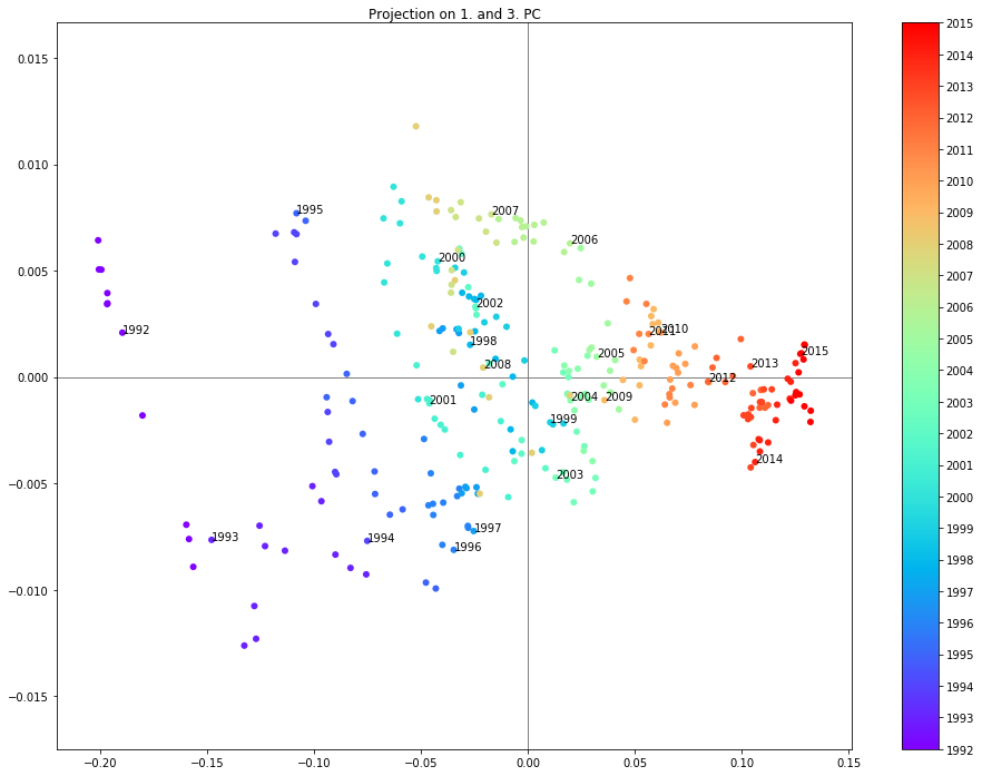
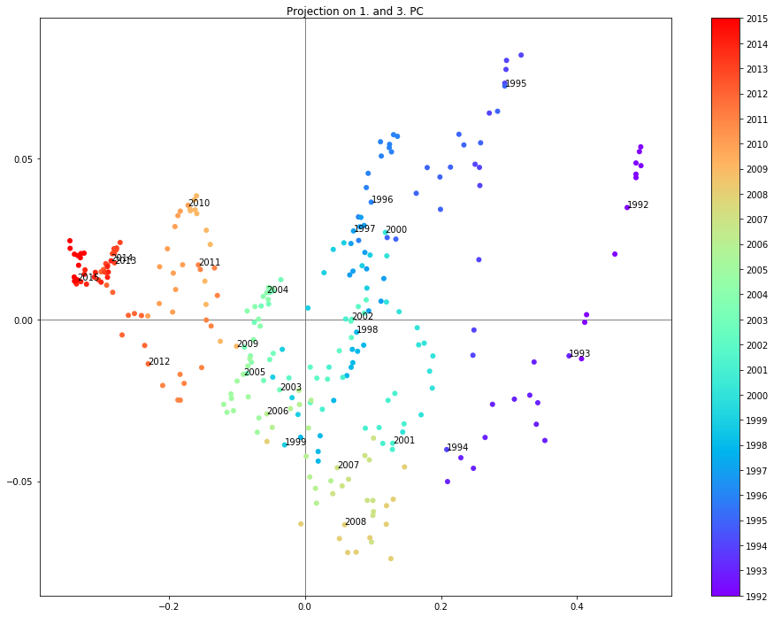
Projection on the 1. and 3. PC
# plot the result
merged_years = 1
pc1 = 0
pc2 = 2
fig = plt.figure(figsize=(16,12))
plt.title('Projection on {0}. and {1}. PC'.format(pc1+1,pc2+1))
plt.axhline(y=0,c="grey",linewidth=1.0,zorder=0)
plt.axvline(x=0,c="grey",linewidth=1.0,zorder=0)

sc = plt.scatter(dpca.loc[:,pc1],dpca.loc[:,pc2], c=[d.year for d in dpca.index], cmap='rainbow')
cb = plt.colorbar(sc)
cb.set_ticks(ticks=np.unique([d.year for d in dpca.index])[::1])
cb.set_ticklabels(np.unique([d.year for d in dpca.index])[::1])

for year in range(df.index.min().year,df.index.max().year+1,merged_years):
    year_start = df.index[df.index.searchsorted(pd.datetime(year,1,1))]
    year_end = df.index[df.index.searchsorted(pd.datetime(year+merged_years-1,12,31))]

    plt.annotate('{0}'.format(year), xy=(dpca.loc[year_start,pc1],dpca.loc[year_start,pc2]), xytext=(dpca.loc[year_start,pc1],dpca.loc[year_start,pc2]))

None
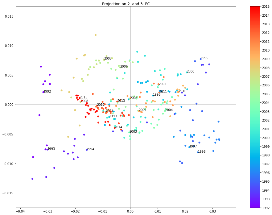
Projection on the 2. and 3. PC
# plot the result
merged_years = 1
pc1 = 1
pc2 = 2
fig = plt.figure(figsize=(16,12))
plt.title('Projection on {0}. and {1}. PC'.format(pc1+1,pc2+1))
plt.axhline(y=0,c="grey",linewidth=1.0,zorder=0)
plt.axvline(x=0,c="grey",linewidth=1.0,zorder=0)

sc = plt.scatter(dpca.loc[:,pc1],dpca.loc[:,pc2], c=[d.year for d in dpca.index], cmap='rainbow')
cb = plt.colorbar(sc)
cb.set_ticks(ticks=np.unique([d.year for d in dpca.index])[::1])
cb.set_ticklabels(np.unique([d.year for d in dpca.index])[::1])

for year in range(df.index.min().year,df.index.max().year+1,merged_years):
    year_start = df.index[df.index.searchsorted(pd.datetime(year,1,1))]
    year_end = df.index[df.index.searchsorted(pd.datetime(year+merged_years-1,12,31))]

    plt.annotate('{0}'.format(year), xy=(dpca.loc[year_start,pc1],dpca.loc[year_start,pc2]), xytext=(dpca.loc[year_start,pc1],dpca.loc[year_start,pc2]))

None
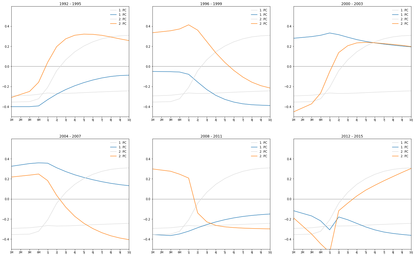
Principal Components by Year
pca = PCA(n_components=2, copy=True, whiten=False)

merged_years = 4

cols = 3
num_years = df.index.max().year-df.index.min().year
rows = math.ceil(num_years/cols)

plt.figure(figsize=(24,(24/cols)*rows))

colnum = 0
rownum = 0
for year in range(df.index.min().year,df.index.max().year+1,merged_years):
    year_start = df.index[df.index.searchsorted(pd.datetime(year,1,1))]
    year_end = df.index[df.index.searchsorted(pd.datetime(year+merged_years-1,12,31))]

    pca.fit(df.ix[year_start:year_end,:].values)
    pca_components = np.transpose(pca.components_)

    plt.subplot2grid((rows,cols), (rownum,colnum), colspan=1, rowspan=1)
    plt.title('{0} - {1}'.format(year_start.year, year_end.year))
    plt.xlim(0, len(pca_components)-1)
    plt.ylim(-0.5, 0.6)
    plt.xticks(range(len(pca_components)), dt.index, size='small')

    for i, comp in enumerate(pca.components_):
        plt.plot(pcaA.components_[i], label='{0}. PC'.format(i+1), color='#dddddd')
        plt.plot(comp, label='{0}. PC'.format(i+1))
    plt.legend(loc='upper right')

    if colnum != cols-1:
        colnum += 1
    else:
        colnum = 0
        rownum += 1

None
pca = PCA(n_components=2, copy=True, whiten=False)

merged_years = 4

cols = 3
num_years = df.index.max().year-df.index.min().year
rows = math.ceil(num_years/cols)

plt.figure(figsize=(24,(24/cols)*rows))

colnum = 0
rownum = 0
for year in range(df.index.min().year,df.index.max().year+1,merged_years):
    year_start = df.index[df.index.searchsorted(pd.datetime(year,1,1))]
    year_end = df.index[df.index.searchsorted(pd.datetime(year+merged_years-1,12,31))]

    pca.fit(df.ix[year_start:year_end,:].values)
    pca_components = np.transpose(pca.components_)

    plt.subplot2grid((rows,cols), (rownum,colnum), colspan=1, rowspan=1)
    plt.title('{0} - {1}'.format(year_start.year, year_end.year))
    plt.xlim(0, len(pca_components)-1)
    plt.ylim(-0.8, 0.8)
    plt.xticks(range(len(pca_components)), dt.index, size='small')
    plt.axhline(y=0,c="grey",linewidth=1.0,zorder=0)

    for i, comp in enumerate(pca.components_):
        plt.plot(pcaA.components_[i]-comp, label='{0}. PC'.format(i+1))

    plt.legend(loc='upper right')

    if colnum != cols-1:
        colnum += 1
    else:
        colnum = 0
        rownum += 1

None
Kernel PCA
# calculate the PCA (Eigenvectors & Eigenvalues of the covariance matrix)
# pcaA = PCA(n_components=3, copy=True, whiten=False)

pcaA = KernelPCA(n_components=3,
                 kernel='rbf',
                 gamma=4, # default 1/n_features
                 kernel_params=None,
                 fit_inverse_transform=False,
                 eigen_solver='auto',
                 tol=0,
                 max_iter=None)

# transform the dataset onto the first two eigenvectors
pcaA.fit(df)
dpca = pd.DataFrame(pcaA.transform(df))
dpca.index = df.index
Projection on the 1. and 2. PC
# plot the result
merged_years = 1
pc1 = 0
pc2 = 1
fig = plt.figure(figsize=(16,12))
plt.title('Projection on {0}. and {1}. PC'.format(pc1+1,pc2+1))
plt.axhline(y=0,c="grey",linewidth=1.0,zorder=0)
plt.axvline(x=0,c="grey",linewidth=1.0,zorder=0)

sc = plt.scatter(dpca.loc[:,pc1],dpca.loc[:,pc2], c=[d.year for d in dpca.index], cmap='rainbow')
cb = plt.colorbar(sc)
cb.set_ticks(ticks=np.unique([d.year for d in dpca.index])[::1])
cb.set_ticklabels(np.unique([d.year for d in dpca.index])[::1])

for year in range(df.index.min().year,df.index.max().year+1,merged_years):
    year_start = df.index[df.index.searchsorted(pd.datetime(year,1,1))]
    year_end = df.index[df.index.searchsorted(pd.datetime(year+merged_years-1,12,31))]

    plt.annotate('{0}'.format(year), xy=(dpca.loc[year_start,pc1],dpca.loc[year_start,pc2]), xytext=(dpca.loc[year_start,pc1],dpca.loc[year_start,pc2]))

None
Projection on the 1. and 3. PC
# plot the result
merged_years = 1
pc1 = 0
pc2 = 2
fig = plt.figure(figsize=(16,12))
plt.title('Projection on {0}. and {1}. PC'.format(pc1+1,pc2+1))
plt.axhline(y=0,c="grey",linewidth=1.0,zorder=0)
plt.axvline(x=0,c="grey",linewidth=1.0,zorder=0)

sc = plt.scatter(dpca.loc[:,pc1],dpca.loc[:,pc2], c=[d.year for d in dpca.index], cmap='rainbow')
cb = plt.colorbar(sc)
cb.set_ticks(ticks=np.unique([d.year for d in dpca.index])[::1])
cb.set_ticklabels(np.unique([d.year for d in dpca.index])[::1])

for year in range(df.index.min().year,df.index.max().year+1,merged_years):
    year_start = df.index[df.index.searchsorted(pd.datetime(year,1,1))]
    year_end = df.index[df.index.searchsorted(pd.datetime(year+merged_years-1,12,31))]

    plt.annotate('{0}'.format(year), xy=(dpca.loc[year_start,pc1],dpca.loc[year_start,pc2]), xytext=(dpca.loc[year_start,pc1],dpca.loc[year_start,pc2]))

None
Projection on the 2. and 3. PC
# plot the result
merged_years = 1
pc1 = 1
pc2 = 2
fig = plt.figure(figsize=(16,12))
plt.title('Projection on {0}. and {1}. PC'.format(pc1+1,pc2+1))
plt.axhline(y=0,c="grey",linewidth=1.0,zorder=0)
plt.axvline(x=0,c="grey",linewidth=1.0,zorder=0)

sc = plt.scatter(dpca.loc[:,pc1],dpca.loc[:,pc2], c=[d.year for d in dpca.index], cmap='rainbow')
cb = plt.colorbar(sc)
cb.set_ticks(ticks=np.unique([d.year for d in dpca.index])[::1])
cb.set_ticklabels(np.unique([d.year for d in dpca.index])[::1])

for year in range(df.index.min().year,df.index.max().year+1,merged_years):
    year_start = df.index[df.index.searchsorted(pd.datetime(year,1,1))]
    year_end = df.index[df.index.searchsorted(pd.datetime(year+merged_years-1,12,31))]

    plt.annotate('{0}'.format(year), xy=(dpca.loc[year_start,pc1],dpca.loc[year_start,pc2]), xytext=(dpca.loc[year_start,pc1],dpca.loc[year_start,pc2]))

None