Fundamental Signal Processing Tools applied to IMU Data
In this Jupyter notebook I applied some standard tools of signal processing to the data that I acquired from the inertial measurement unit (IMU) of my smartphone.
Importing Libraries
%matplotlib inline

import numpy as np
import matplotlib.pyplot as plt
from os.path import join
Loading the Data
data = np.loadtxt(join("..", "data", "imu", "pickup2_till.csv"), delimiter=";")
# subtract start delay from time stamps
data[:,0] = data[:,0]-data[0,0]
# convert milliseconds into seconds:
data[:,0]=data[:,0]*0.001

# basic properties of the data series
sample_interval = 0.02
sample_freq = 1.0/sample_interval
sample_num = np.shape(data[:,0])[0]
sample_time = sample_num*sample_interval
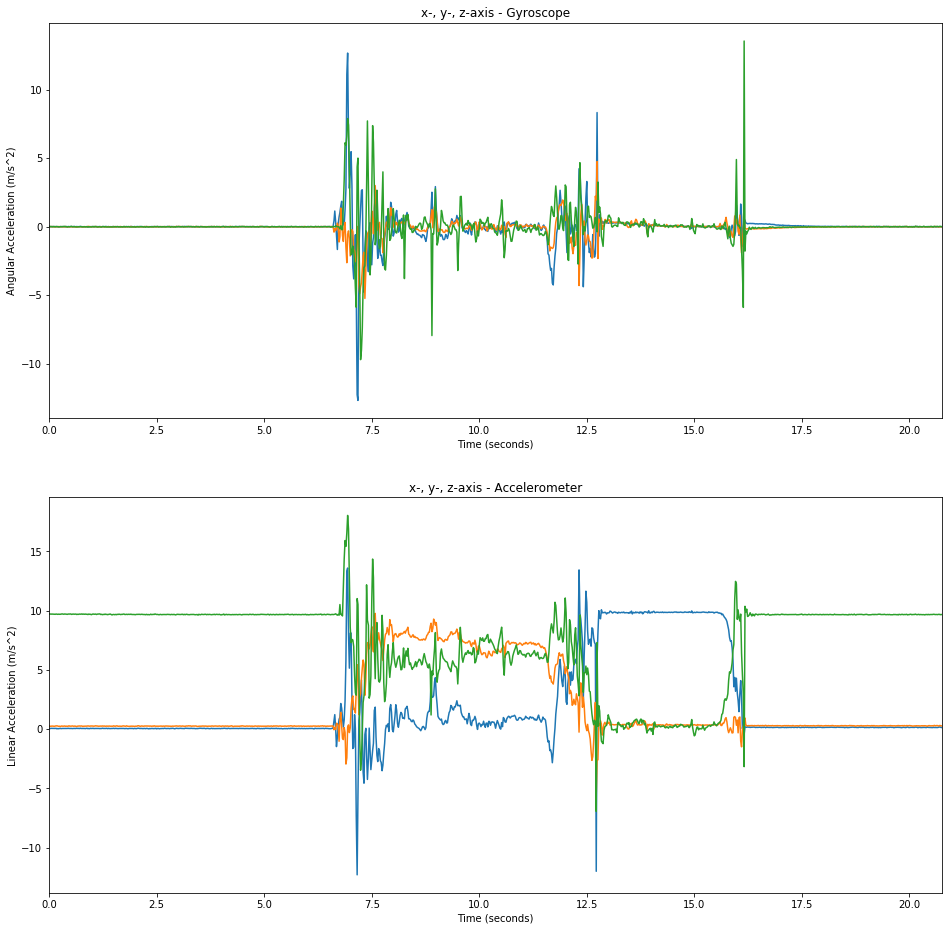
The Accelerometer & Gyroscope Signals
An IMU typically includes a 3-axis gyroscope and a 3-axis accelerometer. Since the sensors must measure a force and by Newton’s second law F = m * a the sensors only measure something when the device is accelerating. That is, if I was able to move the smartphone at a constant speed in one direction (which I’m not able to with my hands), then the accelerometer would not show any reading. Of course in that scenario the gyroscope would not have any reading as well since the the device is not rotating.
The accelerometer does however show the gravitational force. This can be seen in the green line of the plot of the accelerometer data when the device is at rest and the “green”-axis is aligned with the gravitational field. The line is almost at 10 m/s^2 which is what we would expect (9.81 m/s^2).
plt.figure(figsize=(16, 16))
plt.subplot(2,1,1)
plt.title('x-, y-, z-axis - Gyroscope')
plt.xlabel('Time (seconds)')
plt.ylabel('Angular Acceleration (m/s^2)')
plt.plot(data[:,0], data[:,4:-8])
plt.xlim(data[0,0],data[-1,0])

plt.subplot(2,1,2)
plt.title('x-, y-, z-axis - Accelerometer')
plt.xlabel('Time (seconds)')
plt.ylabel('Linear Acceleration (m/s^2)')
plt.plot(data[:,0],data[:,1:-11])
plt.xlim(data[0,0],data[-1,0])
None
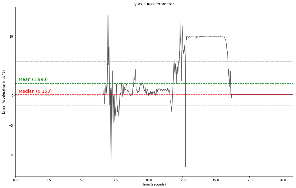
Signal Statistic
Univariate Statistic
# calculate mean and create vector for plotting
mean = np.mean(data[:,1])
# median
median = np.median(data[:,1])
# standard deviation
std = np.std(data[:,1])

# plot the signal
plt.figure(figsize=(16, 10))
plt.title('y-axis Accelerometer')
plt.xlabel('Time (seconds)')
plt.ylabel('Linear Acceleration (m/s^2)')
plt.plot(data[:,0],data[:,1], label='x-axis', color='#555555')
plt.xlim(data[0,0],data[-1,0])

# mean line
plt.axhline(y=mean, color='g', ls='dashed')
plt.annotate('Mean ({0:.3f})'.format(mean), xy=(2, 1), xytext=(0.25, 2.5), fontsize=14, color='g')

# standard deviation line
plt.axhline(y=mean+std, color='#aaaaaa', ls='dashed')
plt.axhline(y=mean-std, color='#aaaaaa', ls='dashed')

# median line
plt.axhline(y=median, color='r', ls='dashed')
plt.annotate('Median ({0:.3f})'.format(median), xy=(2, 1), xytext=(0.25, 0.5), fontsize=14, color='r')

None
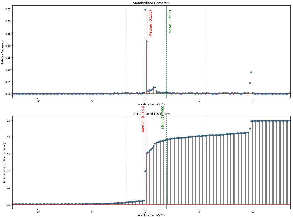
Standardized & Accumulated Histogram
# calculate the normalized counts in each bin
hist_cnt, hist_idx = np.histogram(data[:,1], bins=200)
hist_cnt = hist_cnt/np.sum(hist_cnt)
hist_max = np.max(hist_cnt)

prev_cnt = hist_cnt[0]
hist_cum = np.zeros(len(hist_cnt))
for i_cnt in range(len(hist_cnt)):
    prev_cnt = hist_cum[i_cnt] = hist_cnt[i_cnt]+prev_cnt
hist_cum_max = np.max(hist_cum)


plt.figure(figsize=(20,15))

# plot the histogram
plt.subplot(2,1,1)
plt.title('Standardized Histogram')
plt.xlabel('Acceleration (m/s^2)')
plt.ylabel('Relative Frequency')
plt.xlim(hist_idx[0],hist_idx[-2])
markerline, stemlines, baseline = plt.stem(hist_idx[0:-1], hist_cnt)
plt.setp(markerline, markerfacecolor='#555555')
plt.setp(stemlines, color='#555555')
# mean line
plt.axvline(x=mean, color='g', ls='dashed')
plt.annotate('Mean ({0:.3f})'.format(mean), xy=(0, 0), xytext=(mean+0.2, hist_max*0.97),
             fontsize=14, color='g', rotation=90)
# standard deviation line
plt.axvline(x=mean+std, color='#aaaaaa', ls='dashed')
plt.axvline(x=mean-std, color='#aaaaaa', ls='dashed')
# median line
plt.axvline(x=median, color='r', ls='dashed')
plt.annotate('Median ({0:.3f})'.format(median), xy=(0, 0), xytext=(median+0.2, hist_max*0.97),
             fontsize=14, color='r', rotation=90)


# plot the cumulative histogram
plt.subplot(2,1,2)
plt.title('Accumulated Histogram')
plt.xlabel('Acceleration (m/s^2)')
plt.ylabel('Accumulated Relative Frequency')
plt.xlim(hist_idx[0],hist_idx[-2])
markerline, stemlines, baseline = plt.stem(hist_idx[0:-1], hist_cum)
plt.setp(markerline, markerfacecolor='#555555')
plt.setp(stemlines, color='#555555')
# mean line
plt.axvline(x=mean, color='g', ls='dashed')
plt.annotate('Mean ({0:.3f})'.format(mean), xy=(0, 0), xytext=(mean-0.5, hist_cum_max*1.15),
             fontsize=14, color='g', rotation=90)
# standard deviation line
plt.axvline(x=mean+std, color='#aaaaaa', ls='dashed')
plt.axvline(x=mean-std, color='#aaaaaa', ls='dashed')
# median line
plt.axvline(x=median, color='r', ls='dashed')
plt.annotate('Median ({0:.3f})'.format(median), xy=(0, 0), xytext=(median-0.5, hist_cum_max*1.15),
             fontsize=14, color='r', rotation=90)
None
Normal, Central and Standardized Central Moments
num_raw = 5
num_central = 5
m_raw = np.zeros(num_raw)
m_central = np.zeros(num_central)
m_norm = np.zeros(num_central)
inv_len = np.divide(1.0,np.shape(data[:,1])[0])

for k in range(0, num_raw):
    m_raw[k] = np.multiply(np.sum(np.power(data[:,1], k)), inv_len)
    print("{0}. normal moment: {1:8.3f} (m/s^2)^{0}".format(k, m_raw[k]))

print("\n")
for k in range(0, num_central):
    m_central[k] = np.multiply(np.sum(np.power(np.subtract(data[:,1], m_raw[1]), k)), inv_len)
    print("{0}. central moment: {1:8.3f} (m/s^2)^{0}".format(k, m_central[k]))

print("\n")
for k in range(0, num_central):
    m_norm[k] = np.divide(m_central[k], np.sqrt(np.power(m_central[2], k)))
    print("{0}. standardized central moment: {1:8.3f}".format(k, m_norm[k]))
0. normal moment:    1.000 (m/s^2)^0
1. normal moment:    1.990 (m/s^2)^1
2. normal moment:   17.942 (m/s^2)^2
3. normal moment:  159.736 (m/s^2)^3
4. normal moment: 1646.641 (m/s^2)^4


0. central moment:    1.000 (m/s^2)^0
1. central moment:   -0.000 (m/s^2)^1
2. central moment:   13.982 (m/s^2)^2
3. central moment:   68.383 (m/s^2)^3
4. central moment:  754.406 (m/s^2)^4


0. standardized central moment:    1.000
1. standardized central moment:   -0.000
2. standardized central moment:    1.000
3. standardized central moment:    1.308
4. standardized central moment:    3.859
The distribution is left skew and the distribution is not “flat-topped” as the 4th standardized central moment is > 3 (the 4th standardized moment of the normal distribution).
Entropy
hist_cnt, hist_idx = np.histogram(data[:,1], bins=200000)
hist_cnt = hist_cnt/np.sum(hist_cnt)
entropy = -np.sum(np.multiply(hist_cnt, np.log2(hist_cnt+0.000000001)))
print("Entropy: {0:.2f} bit/symbol".format(entropy))
Entropy: 8.44 bit/symbol
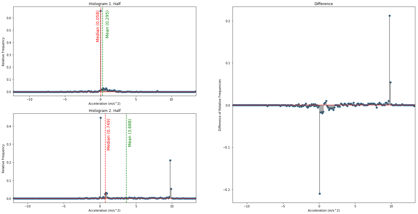
Check for Stationary or Ergodic System
# calculate the normalized counts in each bin
hist_cnt1, hist_idx1 = np.histogram(data[:np.int32(len(data[:,1])/2),1], bins=200)
hist_cnt2, hist_idx2 = np.histogram(data[np.int32(len(data[:,1])/2)+1:,1], bins=200)
hist_cnt1 = hist_cnt1/np.sum(hist_cnt1)
hist_cnt2 = hist_cnt2/np.sum(hist_cnt2)
hist_max1 = np.max(hist_cnt1)
hist_max2 = np.max(hist_cnt2)
hist_mean1 = np.mean(data[:np.int32(len(data[:,1])/2),1])
hist_mean2 = np.mean(data[np.int32(len(data[:,1])/2)+1:,1])
hist_median1 = np.median(data[:np.int32(len(data[:,1])/2),1])
hist_median2 = np.median(data[np.int32(len(data[:,1])/2)+1:,1])
hist_var1 = np.var(data[:np.int32(len(data[:,1])/2),1])
hist_var2 = np.var(data[np.int32(len(data[:,1])/2)+1:,1])

print('\n\t \t H1 \t H2\nMean: \t\t {0:.3f} \t {1:.3f}\nVariance: \t {2:.3f} \t {3:.3f}\n\n'
     .format(hist_mean1, hist_mean2, hist_var1, hist_var2))

# plot the histogram1
plt.figure(figsize=(24,12))
plt.subplot2grid((2,2), (0, 0))
plt.title('Histogram 1. Half')
plt.xlabel('Acceleration (m/s^2)')
plt.ylabel('Relative Frequency')
plt.xlim(hist_idx1[0],hist_idx1[-2])
markerline1, stemlines1, baseline1 = plt.stem(hist_idx1[0:-1], hist_cnt1)
plt.setp(markerline1, markerfacecolor='#555555')
plt.setp(stemlines1, color='#555555')
# mean line
plt.axvline(x=hist_mean1, color='g', ls='dashed')
plt.annotate('Mean ({0:.3f})'.format(hist_mean1), xy=(0, 0), xytext=(hist_mean1+0.4, hist_max1*0.97),
             fontsize=14, color='g', rotation=90)
# median lin
plt.axvline(x=hist_median1, color='r', ls='dashed')
plt.annotate('Median ({0:.3f})'.format(hist_median1), xy=(0, 0), xytext=(hist_median1-0.7, hist_max1*0.97),
             fontsize=14, color='r', rotation=90)

# plot the histogram2
plt.subplot2grid((2,2), (1, 0))
plt.title('Histogram 2. Half')
plt.xlabel('Acceleration (m/s^2)')
plt.ylabel('Relative Frequency')
plt.xlim(hist_idx2[0],hist_idx2[-2])
markerline2, stemlines2, baseline2 = plt.stem(hist_idx2[0:-1], hist_cnt2)
plt.setp(markerline2, markerfacecolor='#555555')
plt.setp(stemlines2, color='#555555')
# mean line
plt.axvline(x=hist_mean2, color='g', ls='dashed')
plt.annotate('Mean ({0:.3f})'.format(hist_mean2), xy=(0, 0), xytext=(hist_mean2+0.2, hist_max2*0.95),
             fontsize=14, color='g', rotation=90)
# median lin
plt.axvline(x=hist_median2, color='r', ls='dashed')
plt.annotate('Median ({0:.3f})'.format(hist_median2), xy=(0, 0), xytext=(hist_median2+0.2, hist_max2*0.95),
             fontsize=14, color='r', rotation=90)

# plot the histogram3 - diff
plt.subplot2grid((2,2), (0, 1), rowspan=2)
plt.title('Difference')
plt.xlabel('Acceleration (m/s^2)')
plt.ylabel('Difference of Relative Frequencies')
plt.xlim(hist_idx2[0],hist_idx2[-2])
markerline2, stemlines2, baseline2 = plt.stem(hist_idx2[0:-1], hist_cnt2-hist_cnt1)
plt.setp(markerline2, markerfacecolor='#555555')
plt.setp(stemlines2, color='#555555')
None
	 	 H1 	 H2
Mean: 		 0.295 	 3.688
Variance: 	 2.401 	 19.827
Multivariate Statistic
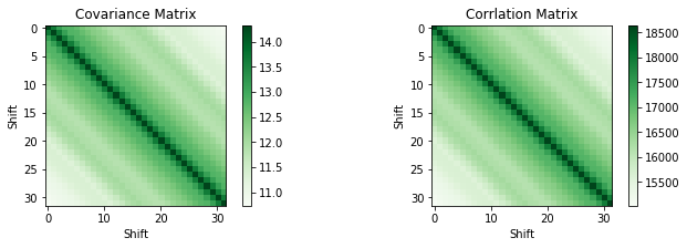
Correlation
# TODO: Cov, Cor with other accelerometer axis
num_shifts = 32
corr_matrix = np.zeros((num_shifts, num_shifts))
cov_matrix = np.zeros((num_shifts, num_shifts))
cov_input = np.zeros((num_shifts,len(data[:-num_shifts])))
for i in range(num_shifts):
cov_input[i,:] = data[i:-num_shifts+i,1]
for j in range(num_shifts):
corr_matrix[i][j] = np.correlate(data[i:-num_shifts+i,1], data[j:-num_shifts+j,1])
cov_matrix = np.cov(cov_input)
plt.figure(figsize=(24, 3))
plt.subplot(1, 4, 1)
plt.title('Covariance Matrix')
plt.xlabel('Shift')
plt.ylabel('Shift')
plt.imshow(cov_matrix, cmap=plt.get_cmap('Greens'), interpolation='none')
plt.colorbar()
plt.subplot(1, 4, 2)
plt.title('Corrlation Matrix')
plt.xlabel('Shift')
plt.ylabel('Shift')
plt.imshow(corr_matrix, cmap=plt.get_cmap('Greens'), interpolation='none')
plt.colorbar()
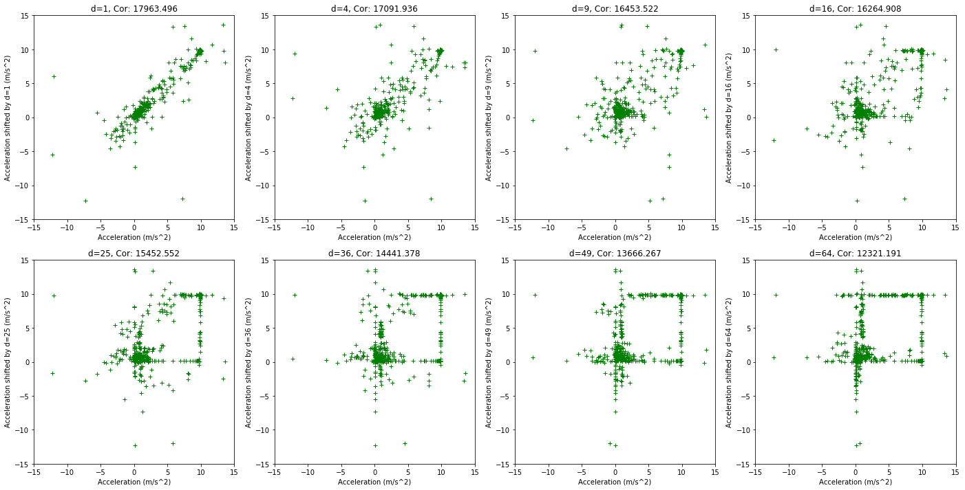
plt.figure(figsize=(24, 12))
for s in range(1,9):
shift = s*s
plt.subplot(2, 4, s)
plt.title('d={0}, Cor: {1:.3f}'.format(shift, np.correlate(data[:-shift,1], data[shift:,1])[0]))
plt.xlabel('')
plt.plot(data[:-shift,1], data[shift:,1], linestyle='', marker='+', color='g')
plt.xlabel('Acceleration (m/s^2)')
plt.ylabel('Acceleration shifted by d={0} (m/s^2)'.format(shift))
plt.xlim(-15,15)
plt.ylim(-15,15)
None
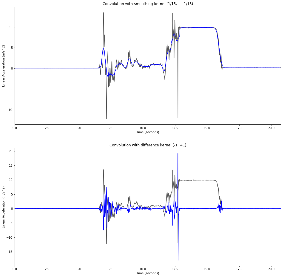
Convolution in the Time Domain
smoothing_factor = 15
change_conv = np.convolve(data[:,1], (-1, 1), mode='same')
smooth_conv = np.convolve(data[:,1], np.multiply(np.ones(smoothing_factor), 1/smoothing_factor), mode='same')

plt.figure(figsize=(16, 16))

plt.subplot(2,1,1)
plt.title('Convolution with smoothing kernel (1/{0}, ..., 1/{0})'.format(smoothing_factor))
plt.plot(data[:,0], data[:,1], color='#555555')
plt.plot(data[:,0], smooth_conv[:], color='b')
plt.xlabel('Time (seconds)')
plt.ylabel('Linear Acceleration (m/s^2)')
plt.xlim(data[0,0], data[-1,0])

plt.subplot(2,1,2)
plt.title('Convolution with difference kernel (-1, +1)')
plt.plot(data[:,0], data[:,1], color='#555555')
plt.plot(data[:,0], change_conv[:], color='b')
plt.xlabel('Time (seconds)')
plt.ylabel('Linear Acceleration (m/s^2)')
plt.xlim(data[0,0], data[-1,0])
None
Frequency Domain
# Nuttall Window
a0 = 0.355768
a1 = 0.487396
a2 = 0.144232
a3 = 0.012604

n = np.arange(0,sample_num)
c1 = (2.0*np.pi)/(sample_num-1)

window_nuttall = a0 - a1*np.cos(np.multiply(n,c1)) \
                    + a2*np.cos(np.multiply(n,2.0*c1)) \
                    - a3*np.cos(np.multiply(n,3.0*c1))
data_ft = np.fft.fft(data[:,1])
ft_freq = np.fft.fftfreq(n=data[:,1].shape[-1], d=(data[:,0][120]-data[:,0][119]))

# frequency in linear order
ft_lin_freq = np.concatenate([ft_freq[np.int32(sample_num/2.0):], ft_freq[:np.int32(sample_num/2.0)]])
# distance beween samples in frequency domain (cycles per second)
ft_delta_w = ft_freq[1]-ft_freq[0]
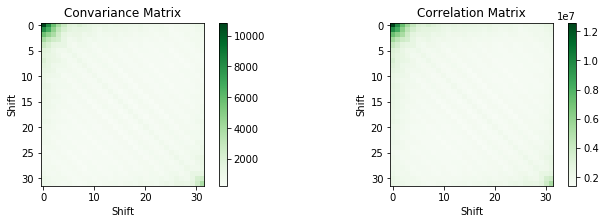
Signal Statistic in the Frequency Domain
num_shifts = 32
corr_matrix = np.zeros((num_shifts, num_shifts))
cov_matrix = np.zeros((num_shifts, num_shifts))
cov_input = np.zeros((num_shifts,len(data_ft[:-num_shifts])))
for i in range(num_shifts):
cov_input[i,:] = np.absolute(data_ft[i:-num_shifts+i])
for j in range(num_shifts):
corr_matrix[i][j] = np.correlate(np.absolute(data_ft[i:-num_shifts+i]),
np.absolute(data_ft[j:-num_shifts+j]))[0]
cov_matrix = np.cov(cov_input)
plt.figure(figsize=(24, 3))
plt.subplot(1, 4, 1)
plt.title('Convariance Matrix')
plt.xlabel('Shift')
plt.ylabel('Shift')
plt.imshow(cov_matrix, cmap=plt.get_cmap('Greens'), interpolation='none')
plt.colorbar()
plt.subplot(1, 4, 2)
plt.title('Correlation Matrix')
plt.xlabel('Shift')
plt.ylabel('Shift')
plt.imshow(corr_matrix, cmap=plt.get_cmap('Greens'), interpolation='none')
plt.colorbar()
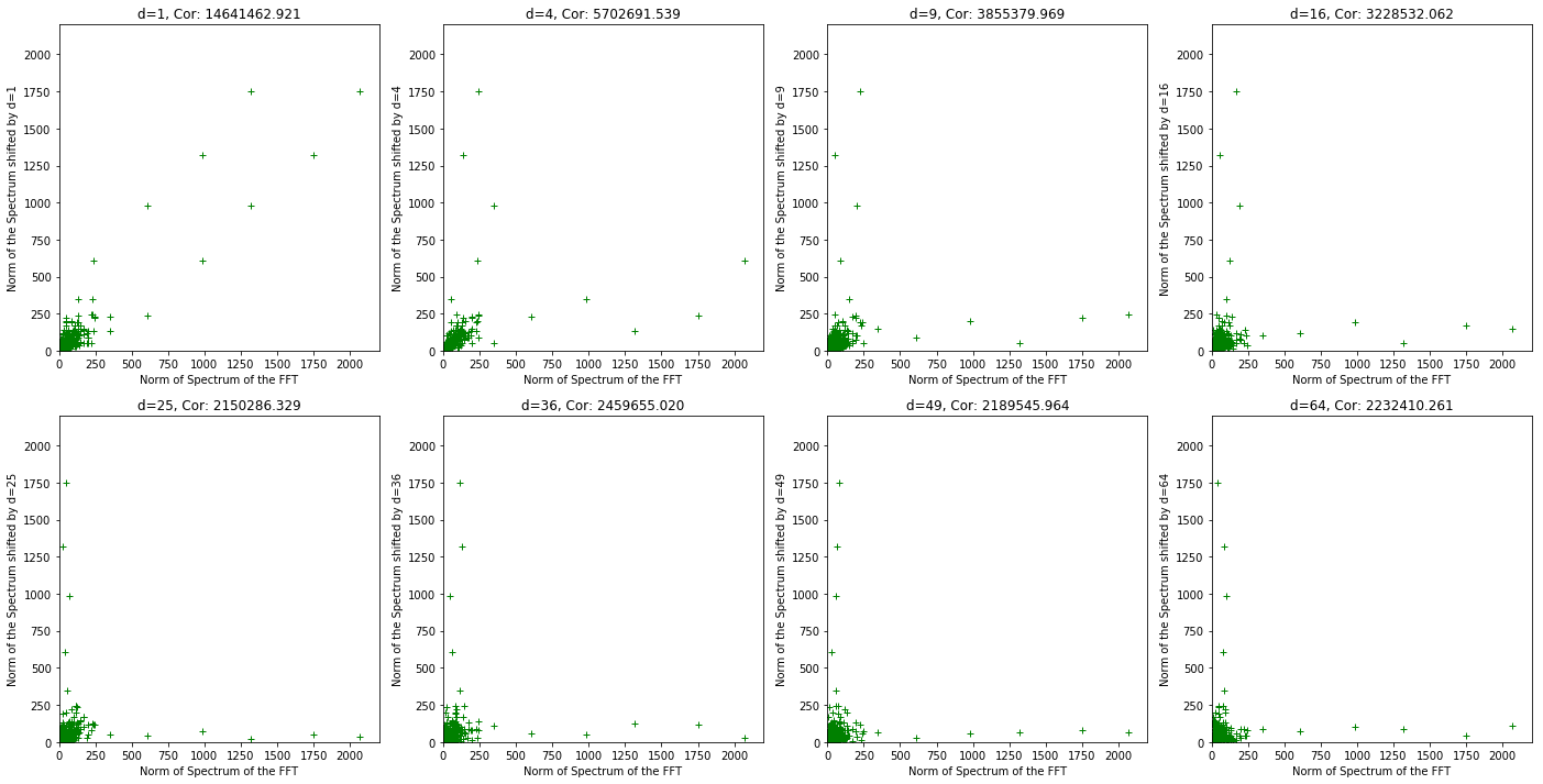
plt.figure(figsize=(24, 12))
for s in range(1,9):
shift = s*s
plt.subplot(2, 4, s)
plt.title('d={0}, Cor: {1:.3f}'
.format(shift, np.correlate(np.absolute(data_ft[:-shift]), np.absolute(data_ft[shift:]))[0]))
plt.xlabel('Norm of Spectrum of the FFT')
plt.ylabel('Norm of the Spectrum shifted by d={0}'.format(shift))
plt.plot(np.absolute(data_ft[:-shift]), np.absolute(data_ft[shift:]), linestyle='', marker='+', color='g')
plt.xlim(0,2200)
plt.ylim(0,2200)
None
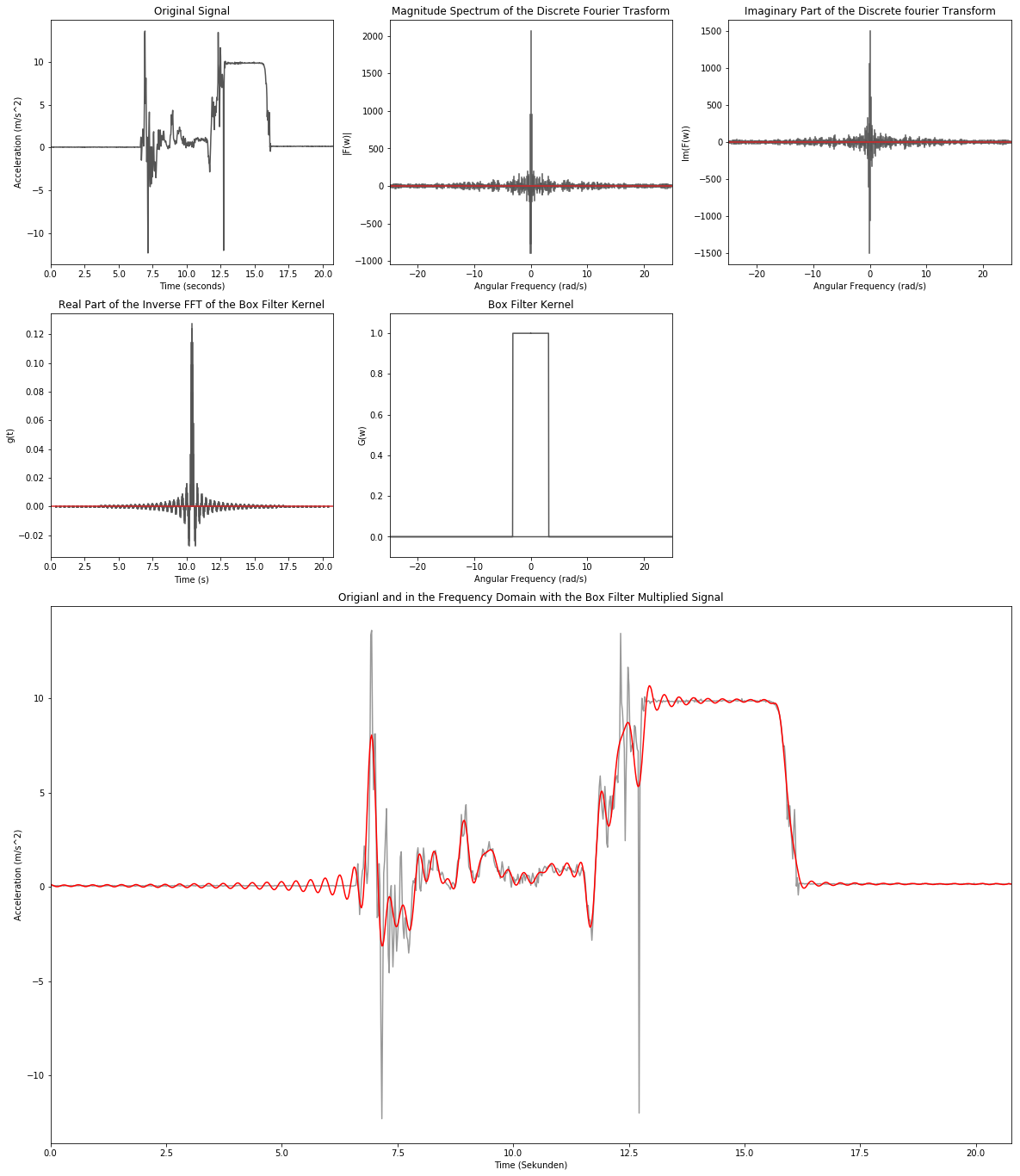
Low-Pass Filtering - Box Filter
low_cut_freq = 20 # Hz
low_cut_omega = low_cut_freq/(2.0*np.pi)
low_idx = np.int32(low_cut_omega/ft_delta_w)

low_rect = np.zeros(sample_num)
low_rect[:low_idx] = 1.0
low_rect[-low_idx:] = 1.0

data_inv = np.fft.ifft(np.multiply(data_ft, low_rect))
low_inv = np.fft.ifft(low_rect)
low_inv = np.concatenate([low_inv[np.int32(sample_num/2.0):], low_inv[:np.int32(sample_num/2.0)]])


plt.figure(figsize=(20,24))

# 1. Zeile
plt.subplot2grid((4,3), (0,0))
plt.title('Original Signal')
plt.xlabel('Time (seconds)')
plt.ylabel('Acceleration (m/s^2)')
plt.plot(data[:,0], data[:,1], color='#555555')
plt.xlim(np.min(data[:,0]), np.max(data[:,0]))

plt.subplot2grid((4,3), (0,1))
plt.title('Magnitude Spectrum of the Discrete Fourier Trasform')
plt.xlabel('Angular Frequency (rad/s)')
plt.ylabel('|F(w)|')
markerline_ft, stemlines_ft, baseline_ft = plt.stem(ft_freq, data_ft.real, markerfmt=' ')
plt.setp(stemlines_ft, color='#555555')
plt.xlim(np.min(ft_freq),np.max(ft_freq))

plt.subplot2grid((4,3), (0,2))
plt.title('Phase Spectrum of the Discrete Fourier Transform')
plt.xlabel('Angular Frequency (rad/s)')
plt.ylabel('Im(F(w))')
markerline_ft, stemlines_ft, baseline_ft = plt.stem(ft_freq, data_ft.imag, markerfmt=' ')
plt.setp(stemlines_ft, color='#555555')
plt.xlim(np.min(ft_freq),np.max(ft_freq))

# 2. Zeile
plt.subplot2grid((4,3), (1,0))
plt.title('Real Part of the Inverse FFT of the Box Filter Kernel')
plt.xlabel('Time (s)')
plt.ylabel('g(t)')
markerline_ft, stemlines_ft, baseline_ft = plt.stem(data[:,0], low_inv.real, markerfmt=' ')
plt.setp(stemlines_ft, color='#555555')
plt.xlim(np.min(data[:,0]),np.max(data[:,0]))

plt.subplot2grid((4,3), (1,1))
plt.title('Box Filter Kernel')
plt.xlabel('Angular Frequency (rad/s)')
plt.ylabel('G(w)')
plt.plot(ft_freq, low_rect, color='#555555')
plt.xlim(np.min(ft_freq),np.max(ft_freq))
plt.ylim(-0.1, 1.1)

# 3. & 4. Zeile
plt.subplot2grid((4,3), (2,0), colspan=3, rowspan=2)
plt.title('Origianl and in the Frequency Domain with the Box Filter Multiplied Signal')
plt.xlabel('Time (Sekunden)')
plt.ylabel('Acceleration (m/s^2)')
plt.plot(data[:,0], data[:,1], color='#999999')
plt.plot(data[:,0], data_inv.real, color='r')
plt.xlim(np.min(data[:,0]), np.max(data[:,0]))
None
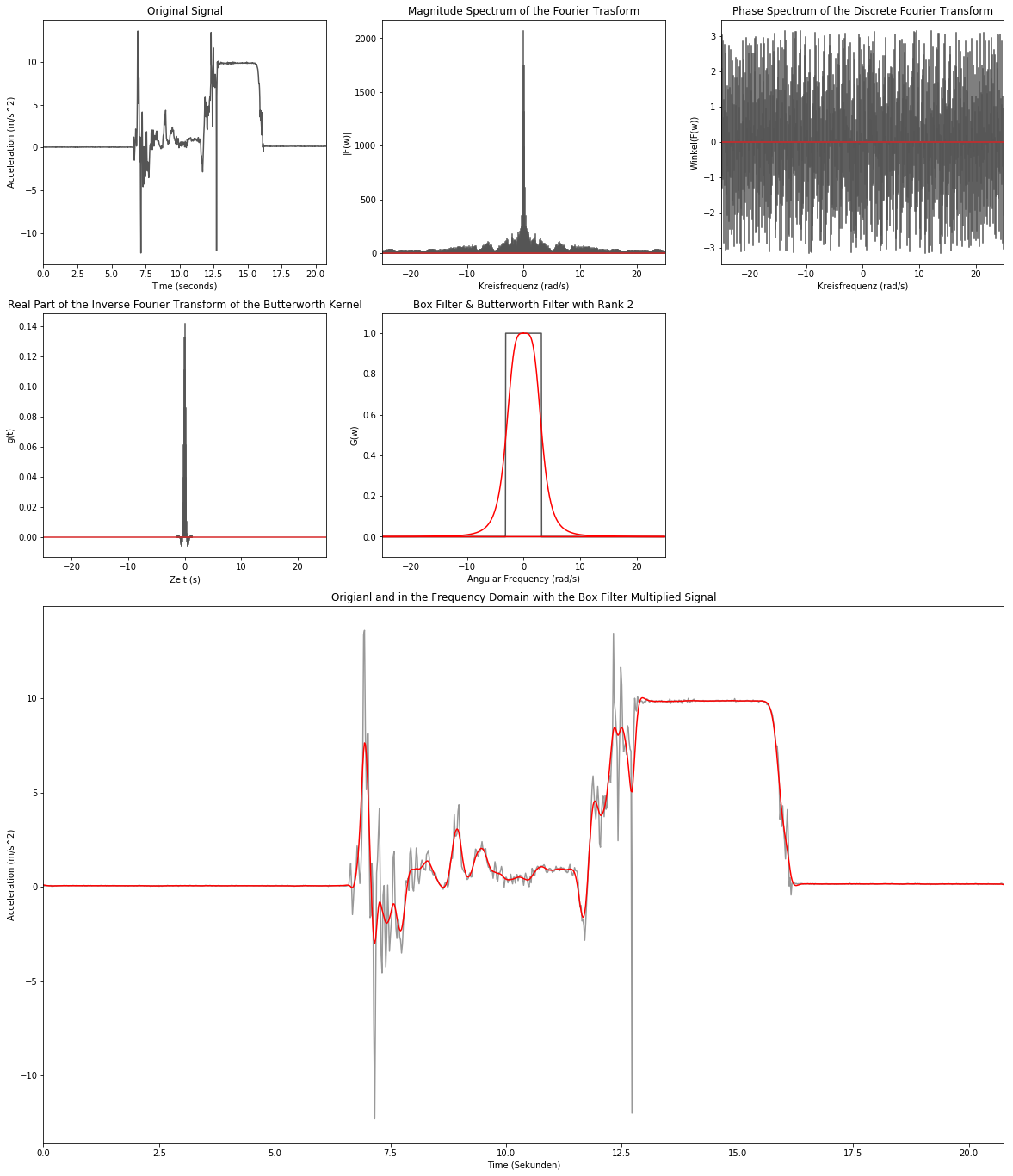
Low-Pass Filtering - Butterworth Filter
butter_order = 2
butterworth = 1/(1+np.power(np.divide(ft_lin_freq, low_cut_omega), 2.0*butter_order))
low_butter = np.concatenate([butterworth[np.int32(sample_num/2.0):], butterworth[:np.int32(sample_num/2.0)]])

data_inv = np.fft.ifft(np.multiply(data_ft, low_butter))
butter_inv = np.fft.ifft(low_butter)


plt.figure(figsize=(20,24))

# 1. Zeile
plt.subplot2grid((4,3), (0,0))
plt.title('Original Signal')
plt.xlabel('Time (seconds)')
plt.ylabel('Acceleration (m/s^2)')
plt.plot(data[:,0], data[:,1], color='#555555')
plt.xlim(np.min(data[:,0]), np.max(data[:,0]))

plt.subplot2grid((4,3), (0,1))
plt.title('Magnitude Spectrum of the Fourier Trasform')
plt.xlabel('Kreisfrequenz (rad/s)')
plt.ylabel('|F(w)|')
markerline_ft, stemlines_ft, baseline_ft = plt.stem(ft_freq, np.absolute(data_ft), markerfmt=' ')
plt.setp(stemlines_ft, color='#555555')
plt.xlim(np.min(ft_freq),np.max(ft_freq))

plt.subplot2grid((4,3), (0,2))
plt.title('Phase Spectrum of the Discrete Fourier Transform')
plt.xlabel('Kreisfrequenz (rad/s)')
plt.ylabel('Winkel(F(w))')
markerline_ft, stemlines_ft, baseline_ft = plt.stem(ft_freq, np.angle(data_ft), markerfmt=' ')
plt.setp(stemlines_ft, color='#555555')
plt.xlim(np.min(ft_freq),np.max(ft_freq))

# 2. Zeile
plt.subplot2grid((4,3), (1,0))
plt.title('Real Part of the Inverse Fourier Transform of the Butterworth Kernel')
plt.xlabel('Zeit (s)')
plt.ylabel('g(t)')
markerline_ft, stemlines_ft, baseline_ft = plt.stem(ft_freq, butter_inv.real, markerfmt=' ')
plt.setp(stemlines_ft, color='#555555')
plt.xlim(np.min(ft_freq),np.max(ft_freq))

plt.subplot2grid((4,3), (1,1))
plt.title('Box Filter & Butterworth Filter with Rank {0}'.format(butter_order))
plt.xlabel('Angular Frequency (rad/s)')
plt.ylabel('G(w)')
plt.plot(ft_freq, low_rect, color='#555555')
plt.plot(ft_freq, low_butter, color='r')
plt.xlim(np.min(ft_freq),np.max(ft_freq))
plt.ylim(-0.1, 1.1)

# 3. & 4. Zeile
plt.subplot2grid((4,3), (2,0), colspan=3, rowspan=2)
plt.title('Origianl and in the Frequency Domain with the Box Filter Multiplied Signal')
plt.xlabel('Time (Sekunden)')
plt.ylabel('Acceleration (m/s^2)')
plt.plot(data[:,0], data[:,1], color='#999999')
plt.plot(data[:,0], data_inv.real, color='r')
plt.xlim(np.min(data[:,0]), np.max(data[:,0]))
None
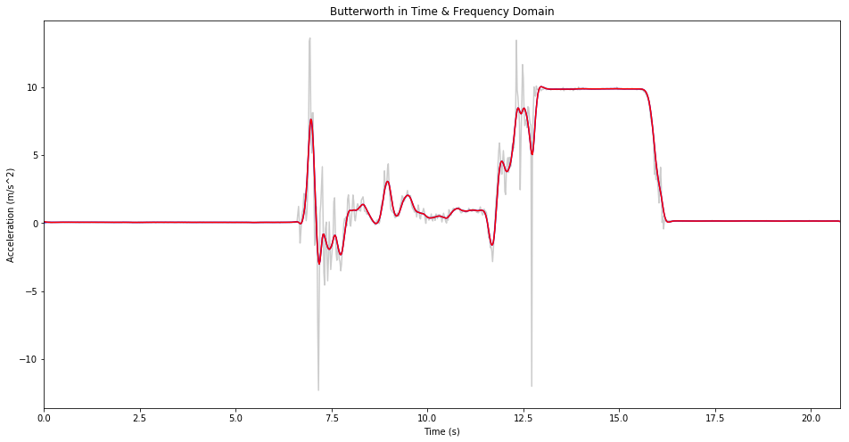
Butterworth in Time & Frequency Domain
butter_conv = np.convolve(data[:,1],
                          np.concatenate([butter_inv[np.int32(sample_num/2.0):],
                                          butter_inv[:np.int32(sample_num/2.0)]]).real,
                          mode='same')

plt.figure(figsize=(16,8))
plt.title('Butterworth in Time & Frequency Domain')
plt.xlabel('Time (s)')
plt.ylabel('Acceleration (m/s^2)')
plt.plot(data[:,0], data[:,1], color='#cccccc')
plt.plot(data[1:,0], butter_conv[1:], color='b')
plt.plot(data[1:,0], data_inv.real[:-1], color='r')
plt.xlim(data[0,0], data[-1,0])

None